Where do Bars get their local beverages? 🍻
Project
Area
UI/UX Design
Brewker
Start
Sept. 2022
Tools
End
On-going
Brewker needed a portal that gave breweries the ability to manager their clients, consumers, and inventory all in one place. The user experience must be straight-forward and easy to navigate so that placing orders is seamless and, most importantly, fast.
Background
Challenge
Design a marketplace management platform that combines all the features breweries use between multiple services to create a seamless search, sell, and delivery experience.
By combining and improving upon the top feature set of competitors, Brewker simplifies the process of finding clients, saving repeat orders, and sharing new beverages. The end goal is to curate an innovative marketplace between breweries and bars.
Solution
Brewker is a hyper-local marketplace that connects drink enthusiasts, bar and restaurant owners, and local retailers with their favorite neighborhood breweries, meaderies and drink designers.
What is Brewker?
Turning “good enough” into really, really great.
Breweries shouldn't have to settle for an ‘okay’ experience with Brewker. The key to improvement is just a little exploration into the specialized services used for distribution. By understanding the unique needs of breweries and seeking input on the distribution experiences they wish to have, we can really create an awesome product that empathizes with its users and caters to their needs.
User Research
Knowing The Audience
During our discussions, I was face time and time again with the same key question:
What does a brewery need to be able to distribute B2B? Breweries could all agree on a few important features for distribution.
Progress starts with knowing what went wrong and learning what will take us the extra mile. The goal is not only correct, but to surpass expectations. To start my research, I spoke with four managers from local breweries in Ohio. I spoke with Dalton Union Brewery and Winery, Derive Brewing Company, Edison Brewing Company, and Land Grant. Each of these breweries is located in the Greater Columbus and Cincinnati area where Brewker operates.
Inventory Management
stock and availability
Sales and Marketing
Promoting products
Order Processing
receive & place orders
Billing and Invoicing
trackable transactions
Distribution Method
Get goods to buyers
User-Friendly Interface
Easy to use
Customer Management
Database of contacts
Great Visuals
Not ugly or outdated
Given the nature of Brewker, it was crucial to understand both the brand's loyal patrons and potential new users. While I didn't have access to extensive testing resources and clients, I relied on informal interviews with regular customers and feedback gathered via the weekly "brewsletters" I managed through Mailchimp. The goal was to pinpoint user pain points with the existing digital touchpoints and to identify opportunities for improving user experience across the web app and website.
Key Insights
Navigational Issues:
Users found the navigation confusing and inconsistent, leading to frustration.Visual Appeal:
The current website lacked the cohesive branding and design elements that users associated with a trustworthy and established business.Mobile Optimization:
There was a disconnect between the brand's messaging on social media and the website’s content, which confused users.
The Old Design
After our discussion, I let each manager explore the current user flow on Brewker. While most breweries reserved and kind enough to compliment, I really wanted to get into the nitty-gritty of what wasn’t working. After all, they had all heard of Brewker but none were currently utilizing our software. More often than not, the managers felt the current site visually unappealing, seemed unintuitive, and just have the feel of a trust-worthy platform. Ultimately, the current Brewker site didn’t have the competitive edge to compete with other platforms or self-distribution.
Competitive Analysis
Evaluating the Market
To position Brewker effectively, I conducted an in-depth analysis of both local and larger-scale competitors, such as Provi and Drizly. This involved a detailed examination of their website structures, design elements, user flows, and market strategies. The primary goal was to identify what these platforms excelled at and how Brewker could differentiate itself by combining the personalized touch of local distributors with the professional feel of major competitors.
condensed version
Insights
User Experience: Competitors with streamlined and intuitive navigation saw higher user retention and engagement. Brewker needed to simplify its user journey to match these standards.
Brand Consistency: Competitors with strong, consistent branding across their websites and social media platforms enjoyed better brand loyalty. Brewker aimed to enhance its brand presence by aligning its digital and physical branding elements.
Mobile Optimization: Many competitors excelled in mobile optimization, providing a seamless experience across devices. Improving Brewker's mobile responsiveness became a priority to cater to an increasingly mobile-first audience.
Market Feedback: Feedback from forums like Reddit, along with user reviews, provided valuable insights into what Brewker could adopt and where it could innovate. For example, Provi’s B2B model and Drizly’s B2C approach offered distinct strengths that could be emulated or enhanced within Brewker's platform.
By leveraging these insights, Brewker aimed to create a platform that not only met industry standards but also offered a unique, tailored experience that resonated with its target audience.
What are the problems to solve and why?
Instead of just taking the research and responses and trying to take on the redesign right off the bat, we needed more. In the Define stage of the Brewker redesign, we pinpoint the specific challenge we're addressing. This ensures that everything focuses on the main problem and the solution we're seeking. During this stage, we want to describe the problem in a way that is broad enough to cover all aspects but not so vague that it becomes unclear. The goal is to strike a balance, providing enough scope for creativity while avoiding overly limiting constraints for our platform
Creating a User Persona
Creating a user persona is essential for the project to redesign, it provides a concrete understanding of our target audience, in this case, brewery managers like Caleb Peters. By understanding their preferences, frustrations, and motivations, we gain insights that assist with user-centric design decisions. We want to ensure the platform meets users’ specific needs. This approach instills empathy, improves the user experience, and increases the chances of adoption as the platform should align closely with the challenges and aspirations of its users.
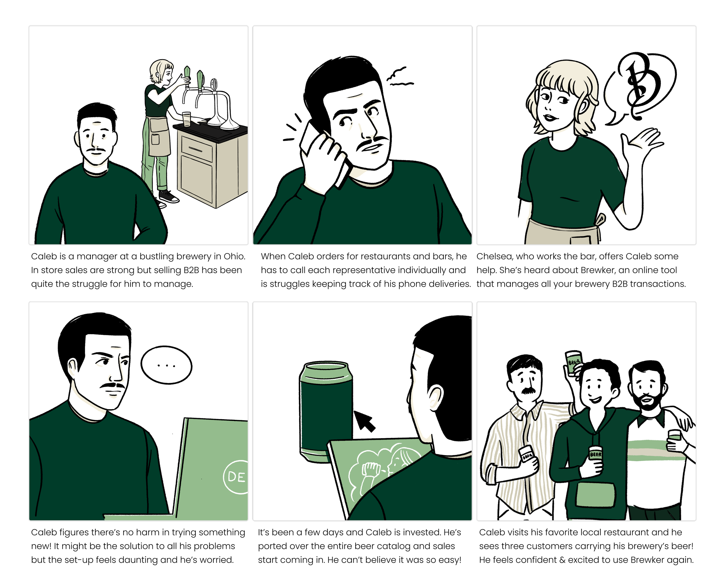
What is Caleb Struggling With?
To really understand and empathize with Caleb, he need a back story. What pain point is he struggling with and how can Brewker help solve his problems? Our storyboard helps illustrate our user’s journey and steps he has to take to get exposed to Brewker and let Brewker address the struggles he is experiencing.
Brewker isn’t a new company. While they did have several issues with design and much feedback for improvement, there was an existing user base. I wanted to keep the redesign similar enough to the original design that previous users would be able to stay on board and integrate seamlessly but I also wanted users to recognize an obvious improvement. I wanted the website to feel fresh and approachable to potential new breweries who might be interested in joining Brewker.
Integrating new solutions into an existing framework.
Mapping the Site
To enhance the redesign process, I created a detailed sitemap aimed at reorganizing the existing pages into a more logical and user-friendly structure. This visual tool ensured that all necessary pages and functionalities were accounted for, leading to a more coherent and intuitive user experience. The sitemap also served as a valuable reference for developers, guiding them in the construction of the final website. Additionally, I developed a user flow for a streamlined order session, simplifying the purchasing process for users.
Initial Wireframes
Based on the insights gathered from user research and competitive analysis, I developed wireframes that addressed key issues like navigation and visual consistency. These wireframes were designed to streamline the user journey, making it easier for customers to explore Brewker’s offerings and connect with the brand.
Navigation Simplification: The new structure was designed with a clear, intuitive hierarchy, allowing users to find what they needed quickly.
Information Hierarchy: I ensured the wireframes reflected the information that would be more important for a brewery to see when using Brewker so that ordering could be straightforward and visually easy to understand.
Below is the wireframe for a simple checkout flow from the perspective of the brewery placing an order for a partner bar .
Testing and bringing it all to life.
Creating a prototype that feels like a real website is vital for proper testing. If I’m too busy having to explain how something functions because I didn’t prototype it well enough, I’m going to miss out on important and feedback insights from my users. If all is done propery, it should be a seamless transition between pages, navigating the Brewker site.
Prototyping
With the wireframes in place, I created interactive prototypes using tools like Figma. These prototypes were essential in visualizing how users would interact with the web app and website.
Feedback Loops: Since formal user testing wasn't available, I relied on feedback from Brewker's team and a small group of current customers. This helped me refine the prototypes before moving into the design phase.
Design Implementation
Visual Design
With the wireframes validated, I moved on to creating the final designs for Brewker's web app and website. The visual design emphasized the brand's rustic aesthetic, using the branding color palette and fun backgrounds reminiscent of the exciting feel of Ohio. Key design elements included:
Consistency: The design maintained a consistent look across all pages, enhancing brand recognition.
Mobile Responsiveness: I ensured that the design was fully responsive, providing a seamless experience on both desktop and mobile devices.
Branding Extensions
In addition to the digital platforms, I extended Brewker's branding to physical products like coasters, stickers, and banners. These items were designed to complement the website’s visuals, reinforcing brand identity both online and offline.
You can find these on the design page for Brewker and campaign materials below.
Website Launch & Feedback
The new website and web app were launched successfully, receiving positive feedback from both the Brewker team and its customers. While formal usability testing wasn’t conducted, the improvements in navigation, visual design, and mobile responsiveness were well-received.
Engagement: Post-launch, Brewker saw an increase in user engagement on their website, particularly from mobile users.
Brand Cohesion: The consistent branding across digital and physical touchpoints helped solidify Brewker's identity, enhancing customer loyalty.
This project, my first UX/UI role, allowed me to refine my design skills while managing various aspects of Brewker's digital presence independently.


